
Understanding and Addressing Colour Blindness in Web Accessibility


A special shoutout to our Senior UX Engineer, Pete Lambert, for writing this article. Out of respect for his Britishness, we've kept the "u" in the word "colour" throughout. Enjoy the read!
---
Thursday May 18th is Global Accessibility Awareness day. At Logikcull, we’re always focusing on accessibility and inclusion in the way that we design and build our product and experience.
Here, we pull back the curtain on one aspect of web accessibility and how we approach it in our daily efforts. We’re hoping it can be helpful for others as they think about accessibility of their content.
Colour Vision Deficiency
Colour blindness, or colour vision deficiency (CVD), is an often overlooked issue that affects a significant portion of the global population. It is a condition where individuals do not perceive colours in the same way most people do, resulting in difficulties in distinguishing between certain colours.
Colour blindness is usually inherited genetically. Red-green colour blindness (the most common variant) is passed down through the X chromosome. In genetic cases, the eye might be missing some cones, which are a key component in how colour is perceived. CVD can also be acquired later in life due to injury, exposure to chemicals or prolonged exposure to very bright light (e.g. welding flames).
Other common forms of colour blindness are deuteranopia (green blindness), protanopia (red blindness), and tritanopia (blue blindness). Deuteranopia and protanopia are collectively referred to as ‘red-green’ colour blindness and account for about 8% of men and 0.5% of women of Northern European descent. Tritanopia, the blue-yellow colour blindness, is much rarer, affecting less than 1% of the population.
These statistics underline a stark reality: a significant number of web users may not be experiencing your content as you intended. For instance, they might not be able to discern critical information in graphs or charts, or distinguish between link text and regular text if the only differentiator is colour.
How Does Colour Blindness Affect Web Use?
Given the predominantly visual nature of the web, colour blindness can greatly impact how an individual interacts with a website. Elements like buttons, links, warnings, and text might all appear different to a colourblind individual, potentially leading to misunderstandings or frustrations.
For instance, a common pitfall is the use of red and green to indicate error and success respectively. For a user with red-green colour blindness, these colour-coded messages might be indistinguishable, leading to confusion.
Similarly, links that change colour when clicked may not provide sufficient feedback for colour blind users if the colour shift is within a problematic spectrum. This can make navigation cumbersome and frustrating.
Colour Blindness Testing at Logikcull
The Logikcull Accessibility team spent some time testing our app using some popular colour blindness simulators such as ColorBlindly, a Chrome extension that simulates eight different variants of CVD, to see how we could improve the experience and be as inclusive as possible to our users.
The various forms of CVD can mean that relative contrast between colours is experienced very differently. Below are some examples of our colour picker widget as viewed with different variants of colour blindness.
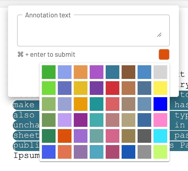
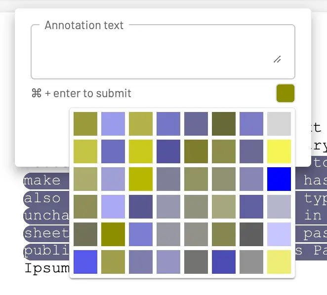
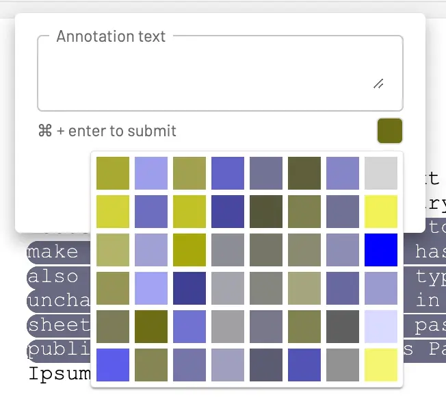
In general, because we’ve previously been careful to ensure good colour contrast, Logikcull holds up well to scrutiny throughout the app. There are places where colour is used to convey information though, and this is where things can get murky.
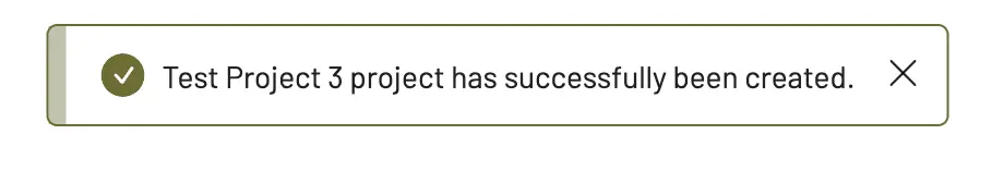
In the screenshot above we see a status notification message where we use green to denote the success of an action. Whilst the green colour is compromised when viewed by a user with Deuteranopia, we’ve ensured good contrast and not relied solely on the colour of the icon or box to get the message across. The checkmark icon ensures that the ‘success’ message is easily understood at a glance. This is a good example of how we make content visually accessible.
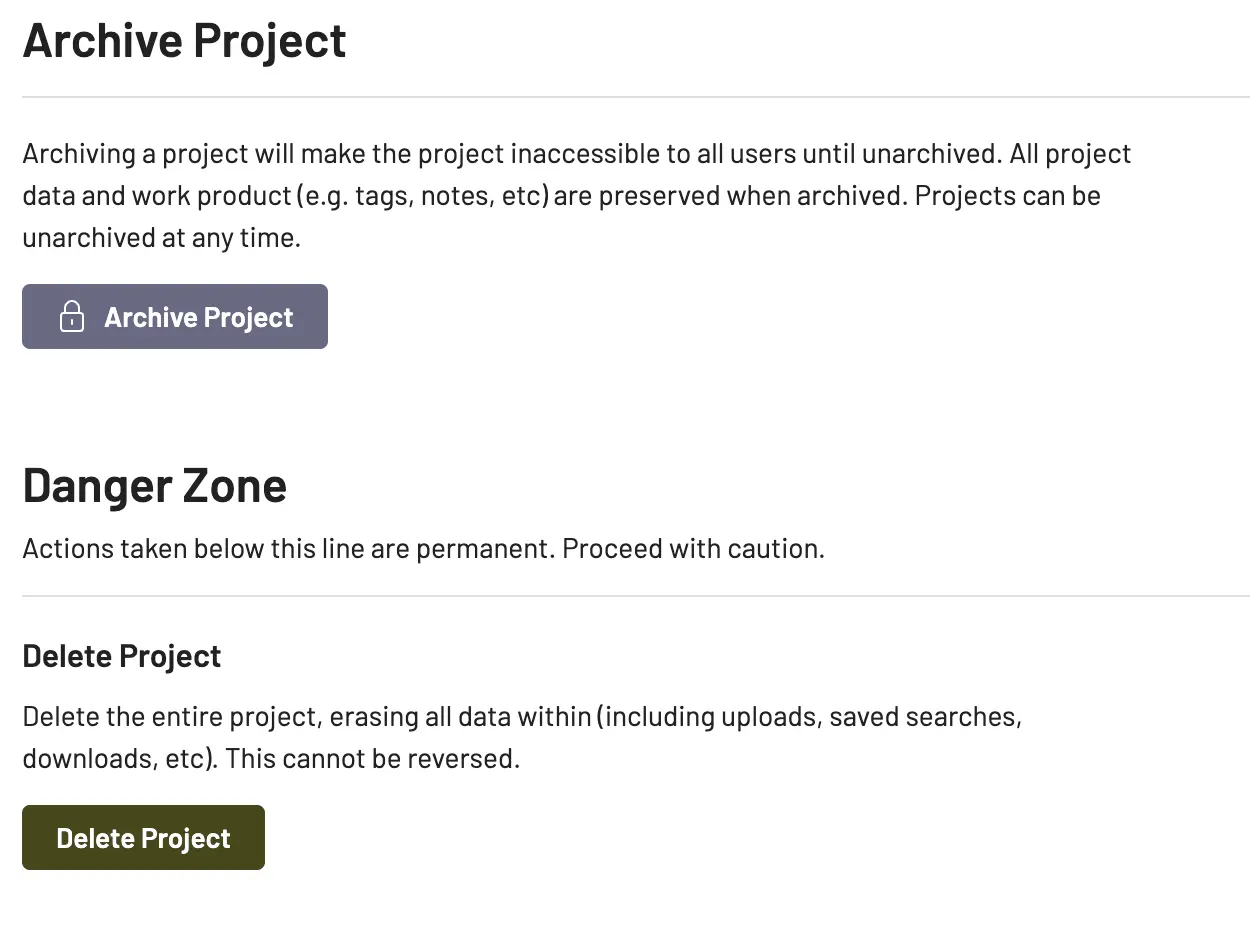
In this final example we can see where our intentions are not being conveyed. A user with Protanopia would see our normally very intentionally bright red ‘Delete Project’ button as a dark green/brown colour, which does not conjure up the same feeling of danger.
We could improve this by also including some iconography that clearly denotes that this is a ‘dangerous’ or ‘destructive’ action, like a warning triangle or an exclamation mark.
Advocating for Web Accessibility
As web developers and designers, it’s crucial to maintain a commitment to inclusivity, ensuring our content is accessible to all users, regardless of their visual abilities. Here are a few strategies to consider:
- Avoid Colour-Reliant Information: Ensure information isn’t only conveyed through colour. For instance, error messages should be accompanied by symbols, and links should be underlined or differentiated from regular text in ways other than colour.
- Use High Contrast: Colourblind users can often still perceive differences in brightness, so high contrast between foreground and background can aid in visibility.
- Use Accessible Colour Palettes: There are several tools available online to help create colour palettes that are accessible to colourblind users.
- Test Your Designs: Tools like colorblind web page filters and simulators can help you see your website as a colourblind person would.
In conclusion, while colour blindness is a common condition, it’s often overlooked in web design. By being aware of the challenges that colourblind users face, and by implementing inclusive design principles, we can create a more accessible web for everyone. As builders for the web, it’s our responsibility to ensure that our platforms are inclusive, usable, and provide an equal experience for all users.
Learning With Logikcull
Browse our latest resources for innovative legal teams like yours


Stay in the know
Get the latest news, expert guidance, and interviews delivered straight to your inbox so you're always one step ahead.
Get the latest updates
Want to see it work?
Request a demo today.
Managing FOIA requests with limited staff, strict deadlines, and pressure to protect sensitive data?
Logikcull is built for this.